Wednesday, July 31, 2013

Guerlain La Laque Couleur #860 Madame Batifole from Fall 2013 Violette de Madame Collection

Mirror mirror on the wall, who is the prettiest fuchsia of all? I can hear Guerlain's new limited edition nail polish standing in front of a mirror and asking this question. How would the mirror answer?


Guerlain La Laque Couleur #860 Madame Batifole from Fall 2013 Violette de Madame Collection

La Laque Couleur #860 Madame Batifole is Guerlain's nail polish release from Violette de Madame Fall 2013 Collection. I recently reviewed one of the eye shadow duos (here) and four shade blush (here) from the same collection. Eye shadow duos and eye liners are joining the permanent line whereas blush, three lipsticks and this nail polish are all limited editions. #860 Madame Batifole is the first limited edition nail polish of Guerlain's new nail polish line, which is released just a few months ago and currently consists of 10 nail polish shades (check reviews of #143 Nahema and #165 Champs-Elysées), one base and one gel top coat.


Guerlain La Laque Couleur #860 Madame Batifole, outdoors, indirect light

New nail polish line of Guerlain consists of shades of reds/pinks and nudes. La Laque Couleur #860 Madame Batifole is no exception. Guerlain rather goes for matching nail and lip looks, so this nail polish is being released with a limited edition Rouge G shade, as well as a Gloss D'Enfer, both with same number and name. Personally, I am not that much of a matching freak. I also like mixing my accessories, like necklace and earrings or rings. The same holds for my make-up. I like clashing colors in a rather what I consider to be the modern way. Therefore I am still waiting for the day Guerlain is going to release some more fun or unique colors independent of their lip products. I like almost gel like consistency of their nail polishes with a rather good coverage in comparison to other gel finishes and because of the flexibility of the texture, I found their these to last a few days more on me than other brands do.


Guerlain La Laque Couleur #860 Madame Batifole, indoors

Guerlain's La Laque Couleur #860 Madame Batifole is a fuchsia red with a touch of blue which makes it appear berry. This appears different in different lighting conditions so I made pictures outdoors with indirect and direct sunlight as well as indoors to give you a better idea. The consistency and formula is on par with other creme/gel nail polishes of this range. It is opaque in two coats and it is not too thick or thin, easy to apply and has a glossy finish.


Guerlain La Laque Couleur #860 Madame Batifole, outdoors, direct sunlight

Guerlain #860 Madame Batifole reminded me of Fall 2012 shade of Chanel, #561 Suspicious, which I honestly don't reach for often. I found Suspicious always a bit harsh and hard to wear on my skin tone. Luckily Madame Batifole has more blue inside, which works a bit better for me. I still tend to go for a tad more muted easy-on-eye shades, such as Chanel #533 April and #589 Elixir. Madame Batifole is more vibrant than Chanel April but close in shade. Chanel #08 Pirate has a close finish but is more red. Chanel #339 Cassis is more violet, Guerlain #168 L'Heure Blue is close but a few shades darker. Once compared to this year fall's Chanel nail polish shade #589 Elixir, it leans less red and more blue.


Guerlain La Laque Couleur #860 Madame Batifole and comparison to similar colors

The closest shade to Madame Batifole is one of my all time favorite berry reds from Chanel, #533 April. I have to admit I prefer Chanel April though, because it is a tad more muted and easy to wear since it is more milky. Nevertheless Madame Batifole makes an excellent transition shade from summer to fall.


Comparison wheel with Guerlain La Laque Couleur #860 Madame Batifole and similar colors

Final thoughts: I can't resist berry shades, so it is a nice addition to my stash. The formula is perfect, somewhere between gel and creme with good consistency, coverage and lasting power. It is rather close to Guerlain #168 L'Heure Bleue, one of their ten permanent nail polishes, which is a few shades darker. The only thing I keep asking myself is, will the nail polishes in Guerlain's line break free of the lip products and will eventually also have unique interesting shades or is this against company policy?

Guerlain La Laque Couleur #860 Madame Batifole is limited edition, has 10 ml / 0.33 oz of product and retails for 23€ / $23. 

Do you like matching lip and nail colors or do you find it rather boring and go for more unique nail color shades?

Share:

Tuesday, July 30, 2013

YSL La Laque Couture #38 Gris Underground, #39 Beige Gallery from Fall 2013 City Drive Collection

YSL released two limited edition nail polishes with their Fall 2013 City Drive Collection. Being very enthusiastic about the formula and packaging of my recent YSL nail polishes purchases, I have taken them in my wish list from the moment I have seen the promo pictures. Now that they are already released in US and about to hit the shelves world wide very soon, I would like to introduce you to YSL La Laque Couture #38 Gris Underground and #39 Beige Gallery.


YSL La Laque Couture #38 Gris Underground, #39 Beige Gallery from Fall 2013 City Drive Collection

After taking them out of their package, I had a desire to check out Gris Underground first, because it didn't appear that gray in the bottle. I was wondering how it would transfer on my nails. After applying I found out it appeared even more "periwinkle" than I thought. I can safely say that YSL #38 Gris Underground is a gorgeous muted periwinkle with creme finish. To me it really is no gray. Check it out yourself...


Outdoors swatch, YSL La Laque Couture #38 Gris Underground

Oh how crazy I am about periwinkle polishes. It reminded me of Butter London Sprog, which almost gave me a heart attack after PA in Breuninger said that it was sold out forever (which turned out to be a wrong information). Anyway, this one is even more gorgeous than BL Sprog, and I think it can be worn four seasons on all occasions. It is work appropriate, yet not boring. It doesn't scream that it is there but takes over the scene silently if you know what I mean. Perfect formula, almost one coater, not thick, not thin, brush is perfect and I can't stop admiring the wide opening of the bottle, which makes application even easier. I definitely need a back-up of this color since I may never be able to find such a balance of everything combined. For me it definitely is perfection in a bottle. Can you resist it?


Outdoors swatch, YSL La Laque Couture #38 Gris Underground

Now comes the second nail polish from City Drive Collection, #39 Beige Gallery. After being so enthusiastic about one shade, it is always hard to talk about the second. Although I would classify Beige Gallery as a light gray taupe leaning slightly mauve, you can come up with your own definition. It is this kind of color which is between all colors and therefore can't be defined easily. I wouldn't call it a beige though, to me it has way too little brown for this category. It reminded me of Laura Mercier's Bare Haze from their Summer Nudes Collection which I recently reviewed and was so excited about (check the review here).


Outdoors swatch: YSL La Laque Couture #39 Beige Gallery

I definitely love Beige Gallery, I do. But still my heart belongs to Gris Underground, which to me is a bit edgier and modern than this one. Beige Gallery had similar formula to Gris Underground. With its perfect consistency, it was a breeze to apply. This one is another color which can be worn four seasons, a rather unusual and interesting nude.


Outdoors swatch: YSL La Laque Couture #39 Beige Gallery

Now comes the interesting part. Going through my stash (which currently takes me over half an hour. I definitely need some improvement on this point), I pulled out some similar shades.


YSL La Laque Couture #38 Gris Underground and #39 Beige Gallery
I got Frenzy in the mix, which is a mushroomy nude and thought it would be like one or the other, but found out it is very different, lighter and more beige (which proves Beige Gallery being not that beige). Rescue Beauty Lounge's Be Humble could resemble Gris Underground but turned out to be too lavender for that, Rescue Beauty Lounge's Forgiveness is more lila and it is also darker. Dior's Trench and Butter London's All Hail the Queen are both more brown than Beige Gallery.  Dior's Gris Trianon is a mauve gray which is close to Beige Gallery but more of a cooler gray with less of blue/periwinkle tones.


Comparison with similar colors vs. YSL #38 Gris Underground and #39 Beige Gallery

As I already suspected, YSL Beige Gallery and Laura Mercier Bare Haze are very similar. LM Bare Haze has just a little bit of Khaki touch to it and Beige Gallery appears slightly cooler but if you have one, I don't think you need the other. Butter London Sprog and YSL Gris Underground are also similar but they are not dupes. BL Sprog is a few tones darker and more blue than YSL Gris Underground.

Nail wheel comparison with similar colors vs. YSL #38 Gris Underground and #39 Beige Gallery
Also check out the following review & comparison post:
Sabrina from The Beauty Look Book and Jenny from Belletristic Beauty


Final thoughts: Both of the nail polish releases of YSL for Fall 2013 City Drive Collection are muted and beautiful nudes. YSL #38 Gris Underground is very unique and slightly edgier than Beige Gallery, which is my favorite. Beige Gallery is more dupable (and very similar to Laura Mercier Bare Haze) but still a modern chic shade for all year around. Formula wise, perfection, as expected from YSL polishes. Be sure to check them out, both are limited editions.

Which is your favorite? Are you getting any of these?

Share:

Monday, July 29, 2013

Guerlain Blush 4 Couleurs Madame Rougit from Fall 2013 Violette de Madame Collection

Without doubt, star product of Guerlain's Fall 2013 Make-up Collection Violette de Madame Blush 4 Couleurs Madame Rougit. It is a four-colored blush with lace design embossed on the surface, matching to the black lace theme of the collection.

Guerlain Blush 4 Couleurs Madame Rougit

The dots on the surface are oversprayed with white sparkling color and goes away after sweeping a few times with a brush. Logo of Guerlain is embossed in the middle of the blush between the dots in an elegant way.


Guerlain Blush 4 Couleurs Madame Rougit

The compact has two decks, lower one hosts a nice and soft mini-brush, which is also pink and fits the rest of the design. Brush is perfect for touch-ups on the go.


Guerlain Blush 4 Couleurs Madame Rougit

The size of the brush is great for picking up all the colors at once but since it is flat, it can also be used to pick up more of a certain color to contour or use one color more intensely than the others. Company name written in pink letters on the brush, which makes everything matchingly feminine and so pretty.


Guerlain Blush 4 Couleurs Madame Rougit and included brush

Up to here, I am smitten by the design and how Guerlain thought of every little detail about this product. Then I want to swatch it. I take a deep breath and hope that the design won't get damaged by doing so. I sweep a finger across the right most tan shade, result is buttery and fine milled. The powder almost melts on my finger. I gasp. Then I bring my second finger to the coral shade, the largest one of the pan. This one is even more smooth, I sigh happily! Then I want to swatch the pale pink shade between the coral and fuchsia. Hmmm... This one is a little harder. But the stripe is so tiny, I come to the conclusion that I can't feel it. I decide to run my finger, this time on the left most fuchsia color. Suddenly I am alarmed. This one feels like plastic! Instead of the buttery texture of the right two shades, this one is hard as a rock and after several sweeps, I look at my finger to see almost no color. I then get a hard creme eye shadow brush and almost scratch the surface (which is not easy to scratch because of the hardness!) to get the following swatches.


Swatch under direct sun light: Guerlain Blush 4 Couleurs Madame Rougit

I take two photos, indoors and outdoors for you to get more idea of the colors. Shades are as follows (on the swatches from left to right):
  • Fuchsia (left most corner): Very hard texture almost no color pay off
  • Light pink (second from left): Hard to tell since it is hard to pick up alone but it is hard, maybe a little softer than fuchsia shade.
  • Soft coral (second from right, the main shade): Buttery texture, very finely milled, almost melts on the skin, good color pay-off for a soft shade.
  • Tan apricot (right most): Texture is as smooth and buttery as the coral part, very soft color but it is true to pan.
On the right most part of the swatches, you can see all the colors applied together with the brush that comes with the compact. As you see the resulting shade is rather coral than pink because the coral and apricot shades have good color pay-off while the other two don't.


Swatch with indirect light: Guerlain Blush 4 Couleurs Madame Rougit

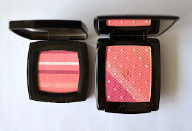
The combination in Madame Rougit reminded me of Chanel's 2012 Spring Limited Edition Blush Horizon, which I found out later on that was already being discussed in many forums. I took a picture of them side by side for those of you who already own Chanel Horizon.


Chanel Blush Eclat Douceur Horizon vs. Guerlain Blush 4 Couleurs Madame Rougit

Once a brush used all over the blush, Chanel Horizon ends up much more pink toned than Guerlain which ends up mostly coral. I think the reason for it is the poor color pay-off of the pink tones in Guerlain Madame Rougit. Chanel Horizon is also more shimmery. Once the overspray is gone, Guerlain Madame Rougit is almost matte.

Chanel Blush Eclat Douceur Horizon vs. Guerlain Blush 4 Couleurs Madame Rougit


Final thoughts: Apply Madame Rougit on your cheeks, you are going to like the resulting soft and defining effect. Unless you want to swatch all the colors one by one, you might never notice this, but I find it very heart breaking that more than one third of the blush has poor quality. By poor quality I mean plastic finish and no color pay-off! I also can't come over the fact that quality is inconsistent throughout the product! At this price range (around 55€) everything should be perfect. I strongly recommend testing this product out yourself before ordering it, unless returns are accepted.

I am dying to know your experiences on this or previous Guerlain products. Please let me know.

Share:

Sunday, July 28, 2013

Guerlain Ecrin 2 Couleurs Eye Shadow Duo in #06 Two Parisian from Fall 2013 Violette de Madame Collection

Guerlain's Fall 2013 Collection Violette de Madame started appearing on the counters around the world. Ever since the promo pictures were released, it is one of the most excited/talked about collections of upcoming season in Beauty Blogosphere. I would certainly start my review by introducing the gorgeously designed blush compact, the star of the collection, Blush 4 Couleurs in Madame Rougit. Unfortunately after trying out the blush yesterday and an unsuccessful attempt to swatch it (we will come to that soon), as a statement, I decided to start with another piece of the collection, one of the new permanent eye shadow duos in #06 Two Parisian.

Guerlain Ecrin 2 Couleurs Eye Shadow Duo in #06 Two Parisian

This fall, there are a few duo and trio releases, one of them being Guerlain's new permanent line, Guerlain Ecrin 2 Couleurs. Be it Ecrin 6 Couleurs or much-loved Ecrin 4 Couleurs as well as their singles, Guerlain's eye shadows are famous for their buttery texture, great color pay off and longevity. That is to say, they are usually very consistent in their quality. This is why the expectations from Ecrin 2 Couleurs is very high. 

Let's start with the compact. The packaging is very luxurious and well designed. It has a slim metal compact with gold coating and comes in a velvet porch. It is similar to their Ecrin 4 Couleurs compacts but looks like as if cut in half, if this makes sense.


Guerlain Ecrin 2 Couleurs Eye Shadow Duo Packaging

Intuitively I tried to open it from the longer edge, but its design has a twist here. The shorter edge is the opening edge, which, in my opinion, gives a modern touch to the design. Two shadows are places on the right hand side. Next to it there is a long sponged-tipped applicator with one normal and one slimmer end. The lid hosts a mirror, which I find to be easier to use given that it is longer rather than wider.


Guerlain Ecrin 2 Couleurs Eye Shadow Duo in #06 Two Parisian (nail polish: YSL Rose Baby Doll)

From the promo pictures, #06 Two Parisian appeared to me like the ultimate smokey eye duo, with a soft pink and a deep black which could be used as a liner and as a definition on the crease and outer edge. What promo photos and such kind of close-ups don't tell you is the texture of the eye shadows...


Close-up: Guerlain Ecrin 2 Couleurs Eye Shadow Duo in #06 Two Parisian

After I swatched it, I was surprised to see that the light delicate pink has glitter finish. Don't get me wrong, I was not disappointed, if you follow my Tom Ford Eye Shadow Series you know how much I like glitters, it was just unexpected to have glitter in a eye shadow duo. Think about it, you only have two shadows and one is glitter on an almost transparent base. I didn't know right away if this would work. What would be the base color then? Luckily the black color has very good quality. It is not that buttery, but I find it helpful in terms of longevity if matte shades are a tad drier. This one has great color pay-off, has no fall out (yes a black without fall out!) and can be controlled to sheer or dense application.


Indoor and outdoor swatches of Guerlain Ecrin 2 Couleurs Eye Shadow Duo in #06 Two Parisian

I didn't know how to start with the application. I usually apply the base color on entire lid, but base color? Which base color? Anyway I applied a tiny bit more primer to make sure that the glitters stick and don't fall out. I tried two techniques, one on each eye. It turns out that they give exactly the same results.

Approach #1: 
I assumed the glitter shade would be my base color, so I started applying it all over the lid, stopping right under the crease, then started defining the crease and outer corner of the lid with the black shade. I then padded some more glitter shade with my fingers on the lid. 

Approach #2: 
I started by defining the crease and the outer corner with the black shade, going sheer at first, building up the intensity slowly. I then padded the glitter shade with my fingers on the lid. I went back to define the crease a little more as a finishing touch.

I then lined and smudged a black eye pencil along upper and lower lash line, finished the look with mascara on top and bottom lashed.

Result: I was impressed! This one wore like a rock on 40ºC all day long, the glitter didn't wander all around my face and the black shade didn't fade.


In Action: Guerlain Ecrin 2 Couleurs Eye Shadow Duo in #06 Two Parisian

Final thoughts: New eye shadow duo line from Guerlain is very inviting with its luxurious compact and interesting shade choice. I was more than skeptical having a duo with one glitter and one very deep shade to start with but I am impressed with the result. Glitter stays put and doesn't wander on the face. Black shade had no fall out and great color pay-off. Result is exactly at the right point of being not over the top but giving you this shiny magical eye. I can imagine with a creme shadow base of the color of your choice, this duo offers endless possibilities.

Do you like the idea of eye shadow duos? Are you lusting over some of the new eye shadow duos from Guerlain?

Share:

Saturday, July 27, 2013

YSL Palette City Drive Classy Wet & Dry Eyeshadows from Fall/Winter 2013 Collection

The second palette from City Drive Editions of Yves Saint Laurent's Wet & Dry Eyeshadow formula is a natural one called "Classy" as opposed to the other one in this collection being crazy, vibrant and sparkly (check out the review here). 


YSL Palette City Drive Classy Wet & Dry Eyeshadows from Fall/Winter 2013 Collection

YSL offers something for all. If you are after some special occasions makeup product then Palette "Arty" can be for you. If you are a natural lover or would like a day-time look product, YSL offers "Classy"for you. I usually like trying unusual combinations. You can say that I am rather brave when it comes to applying color on the eyes so I was expecting that my favorite of this collection would be "Arty" palette. 


YSL Palette City Drive Classy (right) Arty (left) Wet & Dry Eyeshadows from Fall/Winter 2013 Collection

After applying both of the palettes though, the unexpected happened. I fell in love with "Classy" Palette, so much that I tweeted a few day ago these lines " I am officially in love with YSL City Drive Classy Quad. I think it is THE natural palette of Fall 2013". Now let's see why I was so blown away... 


Close-up: YSL Palette City Drive Classy Wet & Dry Eyeshadow

YSL Classy Palette reads quiet warm with three shades out of four, which are all satin without many shimmer. They are even less shimmery than other similar colored YSL Pure Chromatics palettes from their permanent line. Then comes a rather metallic silver as the fourth shade, which makes you think what to do with this one, right? Before we come to the magic of the silver shade, let's check out these one by one:


  • A deep plummy brown with satin finish (upper left)
  • A light peachy champagne shade with satin finish (upper right)
  • A mid-toned warm bronze brown with satin finish (bottom left)
  • A cool silver with metallic finish (bottom right)


Swatch under sun: YSL Palette City Drive Classy
STEP#1
I started applying the peachy champagne (upper right) all over the lid, which makes a fabulous base color in my opinion. Its sheen is just right for the eye shadow not to be flat but it doesn't make it over the top. 

STEP#2
I defined my crease and the outer corner near the lash line in a C shape using the darkest color of the palette (upper left) using a fluffy blending brush like MAC 217. This shade is satin but with very subtle sheen, so does a perfect job in definition.

STEP#3
I added some more color from half of the lid towards the outer corner using the bronze shade (bottom left). I also applied this shade along the lower lash line.

At this point I had a nice warm brown smokey eye. I could just stop here but I think the unusual twist of the palette, the silver metallic shade, is what makes it special, so on to the next step...

STEP#4
I started padding the metallic silver shade (bottom right) onto the lid, concentrated on the inner corner, blending towards the outer corner. This gives some oomph and the little touch of coolness. You can adjust the coolness by padding more and less, making it appropriate for your skin tone or to the occasion (night vs. day). 


I also applied one coat of mascara for the following eye look. I think the photos don't give silver shade the justice. I was really checking it out all day, loving how it looked. It also stayed put all day long without smudging and fading even on a hot summer day.

In action: YSL Palette City Drive Classy

The closest Pure Chromatics eye shadow in my stash was #9, so here they are side by side, in case you already own it and would like to decide if new YSL Palette "Classy" is still worth the splurge.


Comparison of YSL Palette City Drive Classy vs. Pure Chromatics #9

As you can see from the swatches below, the shades are indeed close. YSL Pure Chromatics #9 leans all in all more rosa and less warm but again it doesn't have the silver shade of Classy Palette to cool things down as needed. I still find YSL City Drive Palette in Classy a good buy, even if you have #9 and find it to be different enough to own both.


Comparison swatches of YSL Palette City Drive Classy vs. Pure Chromatics #9

Final thoughts: I was expecting a lot from "Arty" Palette which was a bit too sparkly all over for my taste, lacking different textures and the formula didn't impress me as much as I wished. In return I was not expecting to love "Classy" Palette but I am blown away with the quality, the shades and the clever silver twist to the natural theme. Nothing but love! It is limited edition though, so be sure not to miss that one out.

Do you know another palette with warm naturals and silver metallic shade combined? Do you also find this combo irresistible or would you rather not go for it? 

Share:

Friday, July 26, 2013

YSL Palette City Drive Arty Wet & Dry Eyeshadows from Fall/Winter 2013 Collection

Today I have one of the most interesting releases of this Fall, Yves Saint Laurent's City Drive Palette in Arty, in their Pure Chromatics Wet & Dry Eye Shadow formula. I am very enthusiastic about this formula and I usually love the shades and the different concepts. My recent favorites being their Boreal Palette from Holiday 2012 Collection, which I chose as my Christmas Eve make-up this year winning against many other strong candidates. I was also smitten by their Spring Release, loving that taupe shade, wearing it over and over again. Unfortunately their Pure Chromatics release from Summer, #13 (see the review here), was kind of a reshuffled palette, which disappointed me. This is why when I have seen the promo photos of upcoming Fall Collection, I was very excited to see some crazy color combination.   


YSL Palette City Drive Arty Wet & Dry Eyeshadows

There are two Wet & Dry Eyeshadow Quad released with Fall 2013 collection, Arty and Classy. These both have a special edition packaging. I love the design of those and the colors they chose, Arty have a fuchsia back ground, Classy is over black, so fitting to how they are named. Just a side note, I wore Classy today and will be reviewing it soon, so stay tuned.


YSL Palette City Drive Arty (left) and Classy (right) Wet & Dry Eyeshadows

YSL Quad Arty has an interesting color combination that I have personally never seen before. It reads very cool on the right hand side with sparkly silver and silvery black. The left hand side of the palette has vibrant colors of blue and acid green, which is, without doubt the most surprising shade of this upcoming season in any collection. 


Close up: YSL Palette City Drive Arty Wet & Dry Eyeshadows

Below I swatched the shades wet, using a spray filled with water and my Bobbi Brown Cream Shadow Brush to apply them. This is a synthetic brush with hard bristle, makes it easier to pick up cream products. Since YSL Wet & Dry Eyeshadows dissolve in water, after the brush is wet, upon contact, it acts rather like a creme product on the surface. Therefore I opt for this brush which helps me to pick up more product for a dense application. The shades in this palette are as follows:


  • Vibrant blue with chunky silver glitters (upper left)
  • Dense silver with metallic finish (upper right)
  • Acid green with satin finish (bottom left)
  • Deep anthracite packed with large silver glitters. (bottom right)


Swatch under full sun: YSL Palette City Drive Arty Wet & Dry Eyeshadows

For the eye make-up below, I applied the silver shade (upper right) on entire lid and defined my crease an the outer half of the lash line with anthracite shade (bottom right) in a C-shape. At that point I had a nice metallic smokey eye base. Now it was time to add some color. I started padding the blue shade (upper left) at the outer half of the lid, then the acid green (bottom left) to the middle. I used the silver and blue shades along the lower lash line too, silver from the inner corner to half way and blue from half way to the outer corner. I used a silver eye pencil to my lower water line (Chanel Silver Light) and to finish the look, I applied plenty of mascara.


In Action: YSL Palette City Drive Arty Wet & Dry Eyeshadows

Now let me tell you this, although I was content with the end result, the application was nothing but a breeze. All the shades in this palette have chunky glitters, which make them hard to apply. Especially once used wet, they just don't slide easly like I was used to from other shades of Pure Chromatics range. So I would say the formula here was unfortunately not perfect. But if you like the colors and the interesting combination, with a little bit of more effort you may get interesting results. Once applied over a primer (I used Nars Pro-Prime) it stayed put all day, without smudging and fading.

I really don't know any similar quad, which has an acid green in it, but if you only like the smokey part of the palette without the colors, which is the right part of it, you may want to check YSL Pure Chromatics #12, which is the ultimate evening look Pure Chromatics quad in my opinion. 


Some shades from YSL City Drive Arty Palette vs. YSL Pure Chromatics #12

As the below swatches show, the silver metallic shade in both quads are very close. The anthracite shade in Pure Chromatics #12 has less glitter particles, which makes me wish City Drive Palette Arty would also be like. Since there is the silver shade anyway, it would be possible to combine them anyway for a similar effect. 

Comparison swatches of some shades from YSL City Drive Arty Palette vs. YSL Pure Chromatics #12

Final thoughts: YSL Palette City Drive Arty Wet & Dry Eyeshadows from Fall/Winter 2013 Collection is one of the most interesting products of the season, which combines metallic silver, silvery blue and acid green. The formula with so many glitter particles in each shade is rather hard to apply and needs some patience. I really like the end result though, and how it stays put all day long without smudging and fading over a primer on a hot summer day. I wished the anthracite and blue shades would be less glittery, making glitter optional by using the silver shade as needed.

Can you wear the acid green? Do you like this color combination?

Share:

Wednesday, July 24, 2013

Chanel #62 Presage, Le Blush Creme de Chanel from Superstition Collection for Fall 2013

I was interrupted by Armani Fall madness but now I am back on track. Going on with my review of Chanel Fall 2013 collection Superstition, today I would like to introduce you to Presage. It is one of the six shades of Chanel's new creme blush line, four of which are announced to be permanent. Presage is listed as limited edition together with an interesting burgundy shade called Fantastic. The packaging resembles Chanel's eye shadows and blushes but it is square and almost as sleek as their single eye shadows.


Chanel #62 Presage, Le Blush Creme de Chanel from Superstition Collection for Fall 2013

Presage appears as an intense apricot coral in the pan. Once applied and sheered out, it transforms to a pretty wearable coral on the cheeks which should be flattering for a wide range of skin tones. It is possible to build the intensity up until you look like a clown (which is a positive thing!).

Some blogs report that it dries like a powder, I would say it is not tacky after applied but on me it is not powdery either. I tried different ways to apply it: 
  • With fingers by lightly padding, 
  • With duo fibre blush (like MAC's new limited edition blush from Tropical Taboo collection, No. 159)
  • With Tom Ford creme foundation brush.
I love applying cosmetics with fingers, I got to feel the texture and the product is not wasted. For Le Blush Creme de Chanel though, I had similar experience with Sabrina from Beauty Look Book, once applied with fingers, it almost didn't last for the next three hours. With Duo Fibre brush it was slightly better but lasting power still needed improvement. I do my make-up in the morning before going to work and rarely take makeup with me for touch ups. Since I have normal skin, products usually last on me long, that is from 9am to 6 pm. I was first a little disappointed with Chanel creme blush, until I applied it with a dense brush, Tom Ford creme foundation brush in my case, using circular motions and working it into the skin, it lasted around 8 hours on me. On a side note, I am spoiled by Armani Brush Fabrics, which is a gel formula and last up to 12 hours on me so let's say I am very demanding ;-)


Close-up: Chanel #62 Presage, Le Blush Creme de Chanel

For comparison, I pulled out two similar shades and textures from my stash.YSL Creme Blush #6 and recently released creme blush from Dior in shade Panama (previously reviewed here). Once I run my fingers on them they have similar cremy consistency, but when I swatched, it showed some difference formula wise...


Comparison of  Chanel #62 Presage, Le Blush Creme de Chanel to similar blushes

I think the following swatch shows the difference in textures quiet well. For all of the three I used my fingers and one swipe on my arm after picking up some product. You can see that the shades are pretty close but Chanel Presage is definitely more pigmented, is more matte, it slides like butter and covers the area homogenously. I think this photo speaks for itself too.


Comparison swatches of  creme blushes, Chanel #62 Presage, YSL #6, Dior #651 Panama

I was blown away after the swatch, but would this smooth pigments transfer the same way onto my cheek during application? Since the shades of Dior Panama and Chanel Presage are very close, I decided to carry on an experiment. I applied Dior on my right cheek, Chanel on the left. 

Day #1, Test Dior vs. Chanel, application with fingers
I padded both Chanel Presage and Dior Panama with my fingers. I have to admit I liked how easy was to blend Dior, probably since it was a little less pigmented it was easy to make it look more natural. Dior lasted a few hours more than Chanel, beating it on the first round. 

Day #2, Test Dior vs. Chanel, application with a dense brush
I applied them again one on each cheek, this time using Tom Ford creme foundation blush for both at about 9am. At noon Dior was mostly faded and Chanel was like as if freshly applied. Afternoon Dior faded to almost nothing, leaving a very slight hint of color. Chanel was significantly there. Chanel won the second round.

A few more things to compare, Dior has 7 g of product, Chanel is only 2,5 g (0.09 OZ) and the price point is close, Chanel being slightly less expensive so you get more for your money from Dior but Dior creme blushes are all limited editions and almost sold out everywhere here, which makes it an argument against it. If you ask how I feel about it, I am going with Chanel because it does last me longer, although some of the "anyway tiny amount" of product goes to waste between the fluffy hairs of my lovely Tom Ford creme foundation brush.

Before I conclude, here is how I use Chanel creme blush
  1. I apply my base (below it is Guerlain BB Creme in shade Light 01).
  2. I apply the creme blush heavily on the apples of the cheeks (a little heavier than I would feel comfortable wearing it).
  3. I go with my Chanel Les Beiges powder in B20 on top to fix the base and the creme blush. Since I applied the blush heavily, it fades a little under the powder, giving me a natural look.

Chanel Presage in action, right side without,  left side with


Final thoughts: I like the smooth matte texture of new creme blushes, Le Blush Creme de Chanel. I found out that for my skin, it is crucial to apply it with a dense brush (like Tom Ford creme foundation brush) for it to last all day, which is very important for me. If you like applying creme blushes with your fingers, I recommend you check out Dior creme blushes from their recent Summer Mix collection which gave better performance with fingers.

Do you use creme blushes? Which formula is your favorite? How do you like to apply them?


Share:

Tuesday, July 23, 2013

Caught in Action: Giorgio Armani Eyes To Kill Eyeshadows, #30, #31, #32, #33, #34 Scarabeo Edition from Fall 2013 Kaleidoscope Collection

Giorgio Armani Beauty released the first part of their Fall Collection, Kaleidoscope, which includes eye and lip products (yay!). In case you missed the previous posts, check out swatches of six new lippies here, swatches/application of two new Face & Eye Palettes here and comparison/swatches of five of the six new Eyes to Kill eye shadows here. Previous post about ETK eye shadows was very photo intensive so I decided to post a seperate eye look post to tease you just a little more with these unusual shades. Before I start, please keep in mind that I tried something which is rather colorful and crazy but you can use just one or two shadows and go for a more wearable look. 

Giorgio Armani ETK Eyeshadows, #30, #31, #32, #33, #34 (from left to right) Scarabeo Edition

For my sugar beetle eyes look (!) below, I applied #30 all over the lid. I was already smitten but it was way to simple to post here ;-D so I decided to add some #33 to the outer half of the lid. I defined my crease and along the upper lash line with the darkest of the colors, that is #34. I then added #32 to the inner corner of the eye as a highlighter and #31 along the lower lash line. 

In action: Giorgio Armani ETK Eyeshadows, #30, #31, #32, #33, #34 Scarabeo Edition

Here is a closer shot to show you how these shades appear all together. Please excuse the messy brows! Those really need to be tamed right here and right now. I am considering Dior's brow gel recently launched with their Fall 2013 Collection, has anyone tried that out? Please let me know!

Eye Close-up of the look with Armani Scarabeo ETKs

Today I am wearing these again, this time I applied the gold shade #32 in the middle of the lid. It combines beautifully with blue and violette shades. I know #30 is going to be the most "popular shade" but if I was to select just 3 out of 6, I would go for one blue (probably #34 because of its duochrome property being more intense), the green/yellow (#32) and the violette (#33) to give dimension. I found both blues (#31 and #34) to be rather close once applied.

Notes in terms of application: I love using those wet, which seems to emphasize the beautiful sheen. I love these looks for summer and I can imagine wearing them during late sommer but I don't know about Fall. I also really don't understand how these colors combine with the vampy plummy or orangy lipsticks of the collection. I am going to try to layer those together with the colors from Palettes too. If I find a nice combination, I will let you know.

What do you think? Love it or leave it?

Share:
© Color Me Loud | All rights reserved.
Blogger Template Crafted by pipdig