Tom Ford Ombre Eye Color Trio #01 In The Pink from Fall 2013 Collection

Tom Ford Beauty released two eye shadow trios for their Fall 2013 collection. I have already presented you the taupe gray eye shadow trio called She Wolf and wrote about how genius I find the idea of having a palette consisting of one color. Tom Ford decided to play around with the textures instead of the shades and in my opinion he did it in such a stunning way. Today I would like to show you the second trio, "In the pink" which is a different take on the same concept.


Tom Ford Ombre Eye Color Trio #01 In The Pink

The name of She Wolf made me literally purchase the trio and in the end it made perfect sense considering the gray fur of a wolf. The name of "In the pink" though made me rather suspect if I could pull off a trio consisting of just pinks. Now I can safely say, I find the name misleading with this one, it should be something more like... "In the peach"? In other words there is enough peach in these pinks that would be flattering across the skin tones.


Close-up: Tom Ford Ombre Eye Color Trio #01 In The Pink

"In The Pink" consists of the following shades:

Left: A light matte peachy pink
Middle: A light satin peachy pink
Right: Light peachy pink glitter on a transparent basis 

Below I took photos under the sun as well as in the shadow to give you better idea of the reflection qualities. You see that in shadow the glittery shade looks rather like an eye shadow with frosty finish whereas under the sun, glitter looks more sparse and shimmery.

Swatch under sun: Tom Ford Ombre Eye Color Trio #01 In The Pink
Swatch in shadow: Tom Ford Ombre Eye Color Trio #01 In The Pink

For the below look, I followed these steps:

  • Primed my eyes with Nars Pro-prime.
  • Applied the lightest matte shade (left) all over the lid up to the brow bone and along the lower lash line.
  • Padded the satin eye shadow (middle) on the lid from midway to the outer corner.
  • Picked up some glitter shade with my finger and padded that on the lid, densely on the inner corner, blending it by padding with fingers in the direction of outer corner.
  • Lined my eyes along upper and lower lash line with a cool brown eye liner. Below I used Urban Decay Demolition. I think a black liner would destroy the softness of this look, so with this one I prefer a brown, taupe or soft anthracite liner.
  • I curled my eye lashes and applied one coat of YSL Baby Doll mascara. If I had a brown mascara with me, I would also go for that for the ultimate nude look.

As Belly from Wondegondigo already pointed out, "In the pink" is a little tricky to show up on your lids for some complexions. Check out her post to see how the shades show up on different bases. I am usually NC20-25 but right now despite all the sun screen, I got a bit of a tan and my skin went a few shades darker. As you see from swatches above, the first matte shade shows up good on me so I used this as a base. In the pink might give a rather dramatic eye look for deeper complexions but on my coloring, this gives me soft nude eye, something to pair with a bold lip for a night look or use it daily for a natural nude look. Either way, I liked the resulting look at the moment. I have to go back and try it once I am back to my original coloring and see if it is still visible on my lids. If it is not, I am considering to try a white base, like NYX Milk eye shadow pencil as a base color.

In-action: Tom Ford Ombre Eye Color Trio #01 In The Pink

Final thoughts: Thumbs up for this trio which gives a gorgeous soft, nude look to your eyes with some twist if you pad a little glitter here and there. It is "my eyes but brighter and better" kind of look, similar to what Tom Ford creme eye shadows from their summer collection achieved (check out them in action here). In The Pink is limited edition and will be on Tom Ford counters in September. If you like the pinks but would rather like a denser/deeper look on your eyes, check out Tom Ford's Seductive Rose quad (previously reviewed here), which was previously exclusive to asia but now available around the globe.

Do you like wearing soft shades on your eyes or you rather like your eye shadow appropriately show up? What do you think about glitter on nude looks?

Share:

Tom Ford Ombre Eye Color Trio #02 She Wolf from Fall 2013 Collection

One of the items of Tom Ford Fall 2013 Collection that got my intention shortly after the promo pictures were released was eye shadow trio in #02 She Wolf. On the pictures I have seen a potential of this one making it to the "most used" items of my collection and getting a place on the table instead of being sorted out in drawers or boxes. 

Tom Ford Ombre Eye Color Trio #02 She Wolf

French name given to the product does tell what it is all about, "Ombre A Paupieres Ton Sur Ton". Tom Ford's new trios concentrate on "ombre" (shading) effect of the same color (thus term "ton sur ton") with different finishes. #02 She Wolf offers a gorgeous gray taupe shade in matte, satin and glittery finishes in a Tom Ford signature compact in approximately the size of their blushes (0.16 OZ/4.5 g for $49). It is no secret that I love Tom Ford palettes (remember the blog series?) but this idea of playing with "textures" instead of "colors" sounded almost like a concept for an art project to me. I personally find it genius.


Tom Ford Ombre Eye Color Trio #02 She Wolf

Gray taupe of She Wolf must be flattering across different complexions since it is not very cool nor warm. It is a gorgeous colors for a classical smokey eye, close to cult shades such as Skinny Jeans of Benefit. 


Close-up: Tom Ford Ombre Eye Color Trio #02 She Wolf

Three shades and textures in the compact are as follows:

Left: A deep matte gray taupe
Middle: A mid-toned satin gray taupe with multi dimensional shimmer
Right: A silvery glitter shade on very light gray taupe base


Swatch under direct sun: Tom Ford Ombre Eye Color Trio #02 She Wolf

After reading some other reviews I was a bit cautious and thought that the glitter shade would be over the top.  After the first application, I concluded that She Wolf is going be another go-to palette for me this Fall, for day and night. How? With that much glitter? Let me talk about it in a few seconds and first introduce you with this beauty in action.

It was a breeze to get this look, I followed these steps:
  • Primed my eyes with Nars Pro-prime
  • Applied the middle shade all over the eye lid as well as along the lower lash line
  • Defined close to upper lash line from midway to the outer corner and the crease with left most deep shade.
  • Padded some glitter to the inner corner and sparingly on the lid with my finger.
  • Applied one coat of mascara to upper and lower lashes (YSL Baby Doll)


In-action: Tom Ford Ombre Eye Color Trio #02 She Wolf

I loved how the look came together and if the glitter is used sparingly, this is definitely a day time look for me. It is a little different than Guerlain's new duos, for example #06 Two Parisian, which had no middle shade so the glitter had to be build to get some color on the lid and the resulting look is more of a night time one for my taste. After seeing the resulting look from She Wolf, I remembered about the following video of Lisa Eldridge. She uses Benefit Skinny Jeans as a base, a darker shade on the crease and pads a silver glitter with almost transparent base from a Dior Smokey palette for a "day-time" look which she later on transforms to a evening look by intensifying the glitter shade on the lid and adding a statement lip. Tom Ford's She Wolf is almost all of these products in a compact together, to achieve the look she presents in her video.


Final thoughts: I love the concept and the implementation a well as the resulting look of Tom Ford's new trio in #02 She Wolf. I found this one suitable to day as well as night looks, depending on how much of the glitter is padded on the lid. She Wolf, for me, is definitely the star of Tom Ford's Fall 2013 Collection.

Do you find yourself wearing glitters for the day time too or is it strictly for special occasion/ night time look for you?

Share:

Blog Post Series, Tom Ford Quads VII: The New Natural, #13 Orchid Haze

Together with their Fall 2013 Collection release, there has been some changes to Tom Ford's permanent eye shadow quads. According to Full Time Ford, four eye shadow quads are being discontinued (#09 Violet Dusk & #04 Crushed Amethyst reviewed here, #06 Burnished Amber reviewed here and #07 Cobalt Rush) while two of the asia exclusive quads are made available to the rest of the world (#11 Lavender Lust, reviewed here & #12 Seduction Rose, reviewed here). And most excitingly, Tom Ford released a new eyeshadow palette, #13 Orchid Haze, which I would like to introduce you today.

Tom Ford Eye Color Quad #13 Orchid Haze

Orchid Haze is certainly a crowd pleaser. I can see it becoming the most sold quad in Tom Ford history because of the shades being not too warm, not too cold, not too brown, not too plum nor too pink. To me it lacks the uniqueness of some other Tom Ford Quads such as Burnished Amber or Cognac Sable but it succeeds in curating a stunning neutral quad with superb quality which can be used by majority of people on a daily basis.


Close-up: Tom Ford Eye Color Quad #13 Orchid Haze

Let me emphasize the superb quality... Orchid Haze carries already good formula of Tom Ford quads to the next level. All of the shades are buttery soft and very pigmented. Now I will be writing the next sentence for the first time, I found the darkest shade to be a bit too soft to touch. Too soft? It might be just me but I like my liner/definer matte shades easier to work with when they are a bit drier. Nevertheless the credit must be given since I have experienced no fall out during application. I found a softer brush (e.g. from squirrel hair) for these very soft buttery formula works the best. Below I swatches the shades under sun light and in shadow to give a better idea.


Swatch under sun light: Tom Ford Eye Color Quad #13 Orchid Haze

Orchid Haze is composed of the following shades:

  • A light pink with frosty finish (top left)
  • A soft mid-toned taupe with multi dimensional shimmer (top right)
  • A mid-toned mauve with satin finish, not as shimmery as the other two shades (bottom left)
  • A deep blackened plum with matte finish (bottom right)

Orchid Haze has no glitter shade, similar to #04 Crushed Amethyst and #05 Burnished Amber, which will be both discontinued (still in shock about Burnished Amber, which is one of my all time favorite Tom Ford Quads)

Swatch in shadow: Tom Ford Eye Color Quad #13 Orchid Haze

For the eye look below, I used the lightest pink shade (top left) as the base color and applied it all over the lid. I then used the taupe shade (top right) from mid of the lid all the way to the outer corner and along the lower lash line. I then added some definition by using the dark plum shade (bottom right) on the crease and outer corner of the lid. I then blended these using the mauve (bottom left) shade and added some more of taupe to the mid of the lid to restore the intensity of this particular shade.


In-action: Tom Ford Eye Color Quad #13 Orchid Haze


Final thoughts: Tom Ford released a new quad which most of the people would love and like to own considering its shades. The quality doesn't disappoint either, I found it to be more buttery and smooth compared to the other Tom Ford permanent quads. Orchid Haze is a natural lovers dream. If you want to invest in a solid natural quad which you could make a good use of, consider it. If you would like something more unique, like now discontinued Burnished Amber, you might be among a few who would be disappointed. 

Orchid Haze is going to be available online and on Tom Ford counters around the world in September and it is permanent. It has 10 g/.35 OZ product and retails for 65 EUR/$78,

Do you like investing for more unique palettes or rather for something which you could use everyday?

Share:

My Nail Polish Pick This Summer and Beyond, A-England Excalibur (new version)

A short post for tonight to share with you what I am enjoying right now...

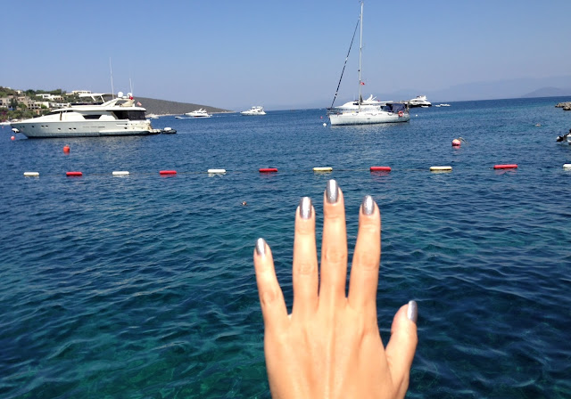
Sun, sea and and a pretty nail polish...

Enjoying a pretty nail polish by the beach

... called Excalibur. It is no secret that I am a sucker for foil finish metallic nail polishes but this must have been the prettiest I have so far. It is a gorgeous silver but not so harsh on the eye or doesn't clash with my (now darker) skin tone since it has golden flecks scattered on the surface. Overall effect is a warm silver if this makes sense.


A-England Excalibur (new version) by shadow

It is gorgeous under the shadow, when the golden flecks become visible. Under sun light, it has multi dimensional and multi colored shimmer added to this gorgeousness. Right now I am wearing it and I see that under artificial light, my nails almost glow. So pretty!


A-England Excalibur (new version) under sun

One more close-up for you to see the golden flecks of different sizes and the gorgeous foil finish which is almost fully opaque by the first coat. Perfect consistency, as I would expect from an a-england polish. And the most shocking truth is yet to come, I have worn this beauty 4 times in the last two months! This is a real success given the size of my stash... 


Close-up: A-England Excalibur (new version)

Oh and I have also given my mom a mani with this and she also loved it. A side note here, she is rather conservative when it comes to nail polish, but this one, although so "shimmery" was not too much for her. 

Final thoughts: Nothing but love for the new version of A-England Excalibur. I am loving it for this summer but I will surely be wearing it all year around. If you are also fan of foil finish, you need this!

What is your favorite nail polish of this summer?

Share:

Chanel Soft Touch Eye Shadow #101 Gri-Gri from Fall 2013 Superstition Collection

There are so many beauties from upcoming season and due to holidays I am a little behind what I would like to introduce you. There is one product which, in my opinion, definitely deserves to be written about. Chanel Ombre Essentielle Soft Touch Eye Shadow in #101 Gri-Gri.


Chanel Soft Touch Eye Shadow #101 Gri-Gri

Gri-Gri comes in a sleek black plastic housing like all other Chanel singles. It delivers what it promises given its name "Soft Touch Eye Shadow" and has a finely-milled soft to touch powder quality. I have to admit I am not a single eye shadow girl and usually find myself reaching for palettes consisting of at least three eye shadows but Gri-Gri was too pretty to pass. This shade has an understated classical feel to it.


Chanel Soft Touch Eye Shadow #101 Gri-Gri

Matching to the concept of the Superstition Collection, Gri-Gri is named after African voodoo amulet which is believed to bring luck. I am just hoping it brings luck once I wear it ;-) I don't know if the name has something to do with this particular shade but I have to admit that after hearing the word "gri" I was expecting some gray variant. Instead it is a soft shimmery mid-toned peachy/pinky taupe. Gri-Gri's shimmer delivers a finish borderline to metallic but I wouldn't call it metallic. In my opinion calling it frost wouldn't be appropriate neither. Instead I would define its finish as one having a beautiful and complex sheen. 


Close-up: Chanel Soft Touch Eye Shadow #101 Gri-Gri

Chanel's Gri-Gri is for those busy mornings, when you don't have time to go for a complete eye look with highlight in the corner or definition on the crease. You can combine it with a nude lippie and a creme blush for the day or a statement lip for the evening. It gives a subtle but bright eye look. 

Below I applied Gri-Gri all over the lid and defined the outer corner slightly with the darkest shade from Chanel's eye quad Mystere (previously reviewed here) from the same collection. Along the upper and lower lashes I applied Chanel Stylo Yeux Water Proof Eyeliner in Khaki Precieux (reviewed here) and I used one coat of Chanel Le Volume Mascara in #40 Khaki Bronze (reviewed here).

In-action: Chanel Soft Touch Eye Shadow #101 Gri-Gri

Final thoughts: Chanel Soft Touch Eye Shadow in #101 Gri-Gri provides you with a polished bright eye look with the swipe of a brush. Easy yet chic, something you would like to check out for this fall.

Do you like wearing singles or do you prefer palettes? Have you checked out Gri-Gri?

Share:

Chanel Le Volume Mascara in #40 Khaki Bronze from Fall 2013 Superstition Collection

You might have noticed how much I like Chanel's Le Volume Mascara, I use it on almost all of my eye looks and I would always conclude the eye look definition by saying "...and I finished this look with x coat of Chanel Le Volume mascara". I like how it provides me more volume and how it holds the curl of my stubbornly straight and thick lashes. When I found out that they were releasing an unusual limited shade for this Fall, I knew I had to try it out.

Chanel Le Volume Mascara in #40 Khaki Bronze

Chanel Le Volume Mascara in #40 Khaki Bronze has the same brush as the regular Le Volume Mascara. I usually use the black one, #10 Noir for dramatic effect or I go for #30 Prune which is a reddish plum if I want my eyes to pop and if the rest of the eye make-up allows using this shade. #40 Khaki Bronze is a soft brown with khaki undertone. I am usually not a khaki fan since those colors, especially on my eyes, seem to blend too much with my skin and eye color. Khaki Bronze however gives me a soft day time look since it is close to the color of my lashes, so I get defined lashes with more volume and it holds the curl nicely while looking very natural and not over done.


Chanel Le Volume Mascara in #40 Khaki Bronze

I am going to post a look using this mascara with the next post. For the time being I would like to show you how it compares to other mascara shades. I included Chanel Le Volume #10 Noir which didn't swatch very good since it is too much loved by me and is about to dry out. Next to it you can see #30 Prune which is almost a red with plum undertone other than a reddish plum. Prune is very close to Rouge Noir shade from Chanel Inimitable Intense mascara line. I would like to also include Armani ETK Excess Volume Mascara in #05. This one is a dark forest green shade which shows that Khaki Bronze is more of a brown than a green. I also included some close ups on brushes so that you can see the color on the wand more clearly.


Chanel Le Volume Mascara in #40 Khaki Bronze vs. Chanel Le Volume #10, #30 and Armani Excess Volume #05
Chanel Le Volume Mascara in #40 Khaki Bronze vs. #10 Noir
Chanel Le Volume Mascara in #40 Khaki Bronze vs. Armani Excess Volume #05

Final thoughts: Chanel Le Volume is by far my favorite mascara and new limited edition shade #40 Khaki Bronze doesn't disappoint. I think they should have added this to the permanent line since right now Chanel lacks a brown in that for softer day time looks. If you like your lashes thicker, holding the curl but not that dramatic and defined, make sure to grab one before Khaki Bronze is sold out.

Do you prefer black mascara or are you in for more natural lash looks?

Share:

Laura Mercier Nail Polishes in Forbidden & Bewitched from Dark Spell Collection

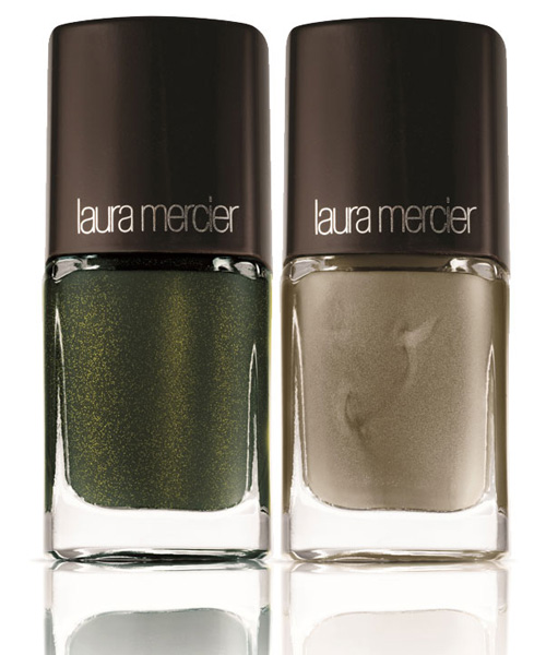
Two of the three items which I selected from Dark Spell Collection of Laura Mercier were nail polishes. I have already talked about the third item, a gorgeous highlighter called Spellbound (reviewed here). Today its their turn, Forbidden and Bewitched are...


Promo photo of Laura Mercier Nail Polishes in Forbidden & Bewitched (source)

...two gorgeous nail polishes which winked at me through their promo photos and I knew I had place for them in my very tightly packed nail polish stash. These days I have to give it a second thought before I commit, as I started running out of place and I don't want to start giving away some discontinued Chanel, not just yet. ;-)


Under sun: Laura Mercier Nail Polish in Forbidden

Forbidden is defined as "silver" but it is a warm taupe leaning platinum shade with metallic finish. Formula is good in terms of consistency but it is prone to visible brush strokes. This doesn't bother me that much since this kind of finish almost always comes with it but if you hate it, this particular shade might not be for you.


Indoors: Laura Mercier Nail Polish in Forbidden

I like how Forbidden changes in each light, pulling warmer or cooler, metallic or more shimmery. Although I don't like metallic eye shadows, I do love metallic nail polishes so Forbidden is a winner for me. I believe Forbidden could be worn all year around.


In shadow: Laura Mercier Nail Polish in Forbidden

The second nail polish from Dark Spell Collection was what most of beauty blogosphere raving about. This one is described as "black with green sparkle". I would call it as deep forest green with gold and teal sparkle. It has a dark base but I don't think it is black. The lovely sparkles which is visible in the bottle transfers onto the nails beautifully, making this one "happy sigh" worthy.


Under sun: Laura Mercier Nail Polish in Bewitched

Consistency of Bewitched is perfect and it is a one-coater for those of you who would prefer to stop right after a full coverage is reached. I almost always use a second coat to increase longevity. I used two coats for the following swatches too.

Indoors: Laura Mercier Nail Polish in Bewitched

I don't have anything like Bewitched in my stash. The size of the sparkles and the base shade makes it very unique. Bewitched offers a seat in the last wagon of "emerald green" train before 2013 is over, so if you like the shade, don't think twice. It is a gorgeous Fall color, but I am thinking about wearing it also during holiday season.


In shadow: Laura Mercier Nail Polish in Bewitched

Final thoughts: I love nail polishes of Laura Mercier's Dark Spell Collection. A lovely metallic shade, Forbidden, is for metallic polish lovers who would tolerate some brush strokes such as myself. Bewitched is a gorgeous unique green with large golden sparkles which are visible on the nail, it is breathtaking.

Have you checked Forbidden and Bewitched out? Can you war nail polish with brush strokes or is it no-go for you?

Share:

Marc Jacobs Style Eye-Con No. 7 Plush Eyeshadow Palette in #204 The Starlet

I ordered my first Marc Jacobs Beauty Item during pre-sales about a month ago, with help from lovely Jenny from Belletristic Beauty. This beauty line is not available in Europe at the moment but I have heard that they are planning a launch next year.

I wanted to give it a go with an eye product (how typically me) and there were two palettes available for pre-sale. One was the purple palette (#202 The Tease) and the other one was looking more "natural" on the photo. There were no swatches and I thought I could understand the line a little better by trying out the natural palette, so decided for Marc Jacobs Style Eye-Con No. 7 Plush Eyeshadow Palette in #204 The Starlet.

Packaging of Marc Jacobs Style Eye-Con No. 7 Plush Eyeshadow Palette in #204 The Starlet

The package comes in a pouch with a staple on one end and a stripe of cloth attached close to the other end with the name of the brand written on it. Inside the pouch there is a sponge tipped applicator, which is probably unnecessary for me and many of you but can come in handy on the go. The fabric of the pouch is not made of velvet as many other beauty brands choose for their products but this one is a thicker and coarser material (I am not sure what exactly it is). I found the overall look rather modern and chic, love that the pouch can be closed so that the palette doesn't get loose or open inside my monster bags. I also like the material of it, since it looks stable and ensures to keep the palette neat and clean.


Marc Jacobs Style Eye-Con No. 7 Plush Eyeshadow Palette in #204 The Starlet
The palette is in a sleek black plastic case and can be opened by pushing a metal knob. Once the upper lid is open, there is a thin plastic which protects the eye shadows with brand name written on it. I really liked the way it looked seamlessly black which reflects on the mirror and made me appreciate the design with a happy sigh. 


Marc Jacobs Style Eye-Con No. 7 Plush Eyeshadow Palette in #204 The Starlet

I removed the plastic protection to reveal the shades. They were looking like in photo, so there were no bad surprises here. We all know there are some promo photos with various filters which may make a neutral palette look purple or vise versa. The palette fits in my palm nicely although it hosts seven eye shadows it is not heavy or bulky but still looking luxurious.


Marc Jacobs Style Eye-Con No. 7 Plush Eyeshadow Palette in #204 The Starlet

The palette consists of seven shades, mostly naturals. The left side of the palette has two taupes, then comes a brown, followed by two natural shades with a twist, a orangey/peachy shade and a yellow gold. On the right most part of the palette there are two cooler toned eye shadows, a light gray and a deeper anthracite. This is what I observed after checking out the shades and right before swatching. I was so excited and by the time I touched the surfaces of the eye shadows, I was smitten by how buttery and smooth the texture was and how pigmented each shade was going. But...


Marc Jacobs Style Eye-Con No. 7 Plush Eyeshadow Palette in #204 The Starlet

After swatching them all on my arm, I looked at it once more and I knew this one was far away from my "dream natural palette which would make it to my everyday eye looks". Then it all made sense, the name of the palette being "The Starlet" and the definition of the shades at Sephora website starting all with the same indication "metallic":

"metallic muted lilac, metallic champagne pink, metallic dark copper brown, metallic bright copper, metallic gold, metallic bluish silver, metallic gunmetal gray."

This one must have been the most interesting natural palette I have come across this year and I couldn't decide if it was in a good way.

Swatch with direct sun light: Marc Jacobs Style Eye-Con No. 7 Plush Eyeshadow Palette in #204 The Starlet
A palette with seven natural metallic shades! Would you come up with this idea? I don't know if it is genius or just dumb but I know this palette is certainly unique!


Swatch with indirect light, Marc Jacobs Style Eye-Con No. 7 Plush Eyeshadow Palette in #204 The Starlet

I am not fond of frosts and this is no secret. So for me it was an interesting experience trying to put an eye look together just using metallic shades, even at crease. I used the first shade all over the lid, the third shade on the crease to define (which is the only dark shade of the palette anyway) and padded the fourth peach shade in the middle of the lid to add a little bit of something to the eye look. I used the 6th shade on the inner corner and a mix of first and third shade along the lower lash line. The good news is that they can be layered and blended easily.


In-action: Some shades from Marc Jacobs Style Eye-Con No. 7 Palette in #204 The Starlet
Make sure to check out the swatches of all four Marc Jacobs Style Eye-Con No. 7 Plush Eyeshadow Palettes by Rads from Weekendramblings.

Final thoughts: I am so confused. Yay for design in all aspects from me and then all these frosty metallic finishes, I don't know what to think about this. If you like these finishes, you should run and pick up one of these palettes, like, right now! But if you are on the same side as me, who rather prefers mixture of finishes, especially if there are 7 different shades, then you may want to keep your money for something else.

Do you like metallic finishes? Is the idea of a palette with 7 metallic shades appeal to you?

Share:

Laura Mercier Spellbound Face Illuminator from Fall 2013 Dark Spell Collection, Review & Comparison

So many pretty products, so little time. Today I would like to talk about an absolutely beautiful highlighter from Laura Mercier's Fall 2013 Collection, called Dark Spell. Here is Laura Mercier Spellbound Face Illuminator...


Laura Mercier Spellbound Face Illuminator

Already in July you might have heard of the buzz in certain blogs as the collection was released early in US. It is still not on the counters in Germany but here is the thing, my favorite SA from Breuninger Laura Mercier counter confessed that they received everything already in July but they were not supposed to sell them! I tried hard arguing that I will be on holiday after they were supposed to be sold but she could only agree to pre-order so I decided to get the products from US, thanks to Mari *waves*. Please take a moment to admire this one, isn't it pretty?


Laura Mercier Spellbound Face Illuminator

If you are following Color Me Loud for sometime, you already know that I am usually drawn to eye products first, but for Laura Mercier Dark Spell Collection, I made an exception and went for the highlighter and nail polishes, which I will review soon. Check out the promo pictures and you will see why. The model has such a beautiful light catching complexion, which got my attention before her eye makeup or lips. 

The surface of the highlighter resembles that of a satin fabric folded irregularly to create a breathtaking play of light and shadow. It looks so modern and chic, don't you agree?


Close-up: Laura Mercier Spellbound Face Illuminator

Once I touch the surface, it feels buttery and finely milled. It goes on smooth and shows the color by one swipe on my arm. I took normal and slightly out of focus photos to show you the gorgeous shimmer. I would define the shade as rose gold in a very general sense, it is more gold and beige than rose though. 


Swatches of Laura Mercier Spellbound Face Illuminator, in focus (left), slightly out of focus (right)

I wanted to see how it compares to other highlighters from my stash. As we are talking about "rose gold" or a tone of "beige", I pulled out Chanel Mouche de Beaute (#5) and Lumiere d'Artifices (#4). I also wanted to compare it to two of my favorite MAC Mineralize Skinfinishes in Light Year (#2) from last year and Adored (#1) from this year.


Laura Mercier Spellbound Face Illuminator and its comparison to other similar highlighters

As the swatches indicate, Laura Mercier Spell Bound is a stronger highlighter once compared to MAC Mieralize Skinfinishes or Chanel Lumiere d'Arfifices but not over the top such as Chanel Mouche de Beaute. It is more "rose" than Chanel Mouche de Beaute and more gold than the others in comparison. You can definitely get Spell Bound show up on many different complexions but you can also use a light hand to apply it, it is up to you.


Comparison swatches of  Laura Mercier Spellbound Face Illuminator and similar highlighters.

Final thoughts: Love the design and the quality alike. I think it must be the prettiest highlighter of this season. 

Have you checked out Laura Mercier Fall 2013 Collection? Which products are catching your attention?
Share:

Chanel Stylo Yeux Waterproof #104 Khaki Precieux from Superstition Fall 2013 Collection, Review & Comparison

On holiday, yay! It has been a week but still trying to catch up on blog whenever I have time. I might have left a few comments unanswered, please excuse me for that. I am trying hard not to miss sun and sea while publishing a post each second day. Right now it is working just fine and I didn't even have to take pictures. It seems making thousand of photos of everything I receive started to pay off *grins*. Anyway I am counting on my hubby who is back home, currently acting as the hero who saves my packages. He will bring a few of them with him while he is coming so that I can keep on posting. Isn't that sweet?

As my effort of trying my best to cover all the items from Fall 2013 collections goes on, today I have a pretty eye liner to share with you: Chanel Stylo Yeux Waterproof #104 Khaki Precieux from Superstition Fall 2013 Collection.

Chanel Stylo Yeux Waterproof #104 Khaki Precieux

Doesn't matter what the others say, I have a weakness towards Chanel Stylo Yeux Waterproof Eyeliners. I like using them especially on my lower lash line as they tend to last long on me. I also like their "in-between" colors and often reach for darker ones also as liners along upper lashes. My favorite ones are #100 Santal, #85 Grenat, #83 Cassis, #70 Black Shimmer for upper lash line and #89 Or Rose, #87 Silver Light, #102 Beryl along lower water/lash line. You can see me using these frequently on my eye looks I post here. When I have seen a khaki eye pencil being released as part of Fall 2013 Chanel collection, I knew I had to have it.


Chanel Stylo Yeux Waterproof #104 Khaki Precieux

Just like other Stylo Yeux Waterproof eye liners, Khaki Precieux comes in a twist-open black housing, including a sharper at the back. Most of the Stylo Yeux Eyeliners do have some fine shimmer, which I especially like having on my lower water line as well on on inner corner as it brings some light and brightness to the eye look. Khaki Precieux is no exception. It is a khaki shade with gorgeous golden shimmer to it. Khaki Precieux also has one of rather softer formulas among Stylo Yeux Eyeliners (for example in comparison to #57 True Blue from Summer Collection which was harder) so it will also be appealing to those who rather like using softer eyeliners.


Swatch under direct sun light: Chanel Stylo Yeux Waterproof #104 Khaki Precieux

I pulled out some similar green/khaki/gold leaning shades from my stash to compare them with Khaki Precieux. Some months ago I had a huge drug store haul, since I was wondering the quality of certain brands, therefore I happened to find a P2 eyeliner which also looked similar. Let's see how they compare...


Comparison to similar shades: Chanel Stylo Yeux Waterproof #104 Khaki Precieux

P2 Intensive Khol in #023 Precious Australia (such a pretty name!) was unfortunately a bit too light. Lancome's Jazzy Taupe is similar in intensity but misses the green/gold hues of Khaki Precieux. I wanted to show you also how Chanel Precision Eye Definer in #104 Khaki Platine compares and as you see this is more of a light taupe rather than khaki. Also other two shades I included from Chanel, #47 Brun Intense and #100 Santal are both more browns so I can comfortably say that Chanel Stylo Yeux Waterproof in #104 Khaki Precieux is the first real Khaki I own from Chanel.  


Comparison swatch under direct sun light: Chanel Stylo Yeux Waterproof #104 Khaki Precieux

I checked out my Urban Decay Vault and found two shades which looked similar. Mildew, though, turned out to have more blue and was very different once applied. Urban Decay Stash on the other hand was considerably close, therefore I included one more swatch between these two. I found Khaki Precieux to have more golden shimmer and a greener base but the difference is rather subtle and on the eyes they look close.


Chanel Stylo Yeux Waterproof #104 Khaki Precieux vs. Urban Decay 24/7 Glide On Stash

Final thoughts: I love my first real "Khaki" Eyeliner from Chanel. I can see myself wearing it rather along my lower lash line and on my lower water line to add brightness and color to my eye looks. It is a lovely shade for this upcoming season, and will add something to neutrals, taupes or even grays. If you already own Urban Decay 24/7 Glide On in Stash, you may want to consider that before splurging. Chanel Superstition Collection is still not available in Germany but we are expecting it any moment.

Do you like this shade as eye liner? Where would you rather use it? Which colors would you combine it with?
Share:
© Color Me Loud | All rights reserved.
Blogger Template Crafted by pipdig