Giorgio Armani Eyes To Kill Macro-Color Solo Eyeshadow #10 Beige Nudo, #15 Parma, #16 Dark Plum, #17 Green Viper and #18 Scarab, Swatch, Review & FOTD

Would you like to see my butterflies for Spring? Here they are. They keep flying around my head and all I can do is to bring them home with me. Do you remember the 4 shades I posted about a few days ago? It turns out I have now 6 more and I would like to show you five of them today, #10 Beige Nudo, #15 Parma, #16 Dark Plum, #17 Green Viper and #18 Scarab.


Giorgio Armani Eyes To Kill Macro-Color Solo Eyeshadow #10 Beige Nudo, #15 Parma, #16 Dark Plum, #17 Green Viper and #18 Scarab

This time I made sure to get all the plums and crazy shades as well as a neutral to ground them down a little. #16 is just a little deeper than #15 so I didn't know if that one was the right choice but given my enthusiasm for plums, it just had to be. A for #18 and #17, I thought they would layer well... Also I believe on the promo picture model is wearing #17 and #18 and yes it is "a little" photoshopped as usual but I would like to try it out nevertheless.


Giorgio Armani Eyes To Kill Macro-Color Solo Eyeshadow #10 Beige Nudo, #15 Parma, #16 Dark Plum, #17 Green Viper and #18 Scarab

On my desk now I have two towers like this and mornings are fun trying to figure out which of them to combine that day. I have been on a blush kick lately but I have to admit that there is nothing like eye shadows that cheer me up.


Giorgio Armani Eyes To Kill Macro-Color Solo Eyeshadow Tower

Here are quick swatches of five of the shades. In case you missed them, I have previously swatched all the shades on the counter here, and four other shades here,

#10 Beige Nudo is a light champagne with golden shimmer. It has shimmery to satin finish. It is not frosty but one of the most shimmery shades of the range.

#15 Parma is a medium plum with satin finish. It leans more red than blue.

#16 Deep Plum is exactly what the name suggests. Deep Plum has satin to matte finish and once applied on the lids, it looks more like matte but with some dimension.

#18 Scarab is a teal which leans more blue than green. Under store lighting it was more green so I thought it would be very unique to my collection but at home and once applied I have seen it to be a blue leaning slightly green. It has satin finish with beautiful green shimmer.

#17 Green Viper is a light yellow green with satin to matte finish. It immediately reminded me of this look and a more friendly version of the acid green in that palette. Right now I enjoy popping a little bit of color, especially on natural looks, so I thought it would be fun to experiment with Green Viper.


Swatches of Giorgio Armani Eyes To Kill Macro-Color Solo Eyeshadow #10 Beige Nudo, #15 Parma, #16 Dark Plum, #17 Green Viper and #18 Scarab


The first look I would like to present you is a combination of #10 Beige Nudo and #18 Dark Plum. I thought the golden hues of Beige Nudo would combine beautifully with Dark Plum.


Giorgio Armani Eyes To Kill Macro-Color Solo Eyeshadow #10 Beige Nudo
Giorgio Armani Eyes To Kill Macro-Color Solo Eyeshadow #16 Dark Plum

By the application, I had a little bit of difficulty while using #10 Beige Nudo because my brush was slightly damp and this formula just don't like it. I applied Beige Nudo all over the lid and added Dark Plum to the outer corner. It was today in the morning and I was in a little bit of hurry so please bare with the degree of blending ;-)


In-Action: Giorgio Armani Eyes To Kill Macro-Color Solo Eyeshadow #10 Beige Nudo & #16 Dark Plum,

For the second look, I used Scarab with Green Viper. Only after I applied and blended I remembered that I haven't used an eye base, so below you can see how these perform without one. On a side note, with a base these do last on me whole day but without base, I found that Scarab creased a little on me. For reference I am using Nars Pro-prime for almost each look.

Giorgio Armani Eyes To Kill Macro-Color Solo Eyeshadow #18 Scarab
Giorgio Armani Eyes To Kill Macro-Color Solo Eyeshadow #17 Green Viper

I wore this one on Saturday, so it is weekend kind of look with vivid colors. I applied Green Viper to the center of the lid and added Scarab to the inner and outer half. I then layered Scarab with Green Viper on the inner lid. I completed this look with UD 24/7 eye liner in Junkie on the water line as well as along the upper lash line.


In-action: Giorgio Armani Eyes To Kill Macro-Color Solo Eyeshadow #17 Green Viper and #18 Scarab

Here is the whole look with Armani Cheek Factory in Dolci on the Cheeks and two/three lipsticks layered on lips. I couldn't get the shade I wanted so I kept adding.  ;-) Also to make it modern, I didn't want to ground greens and blues and wore a coral shirt. 


FOTD: Giorgio Armani Eyes To Kill Macro-Color Solo Eyeshadow #17 Green Viper and #18 Scarab

Final thoughts: I am loving the shades and the formula but the more I use, the more I find out about things that one has to take care of. Don't use them damp/wet and be sure to use a primer for a longer stay. These are now also released in US after Europe. It should be around the globe in no time. 

Which one is your favorite?

Share:

Chanel Joues Contraste #88 Vivacite, #89 Canaille, Review, Swatch & Comparisons

Together with their new foundation Perfection Lumiere Velvet, Chanel released two new blushes from their powder blush, Joues Contraste line. #88 Vivacite is a bright pink and #89 Canaille is a burnt orange. 


Chanel Joues Contraste #88 Vivacite and #89 Canaille

These are both very pigmented with satin to matte finish so while applying one should be light handed. I can see that on deeper tones they will show nicely without even having to build them up by applying over and over again.


Chanel Joues Contraste #88 Vivacite and #89 Canaille


#88 Vivacite is home run for me since it is a cool plummy pink, which I like wearing a lot as blush. It is also very pigmented but not insanely pigmented, so using a soft brush, like Suqqu Cheek, I can get a natural look. I took out some similar blushes from my stash for comparison.


Chanel Joues Contraste #88 Vivacite vs. Chanel #74 Ultra Rose, #87 Emotion, Armani #509 Eccentrico and Tom Ford Narcissist


The most pigmented blushes in my stash must be Armani #509 Eccentrico, which is lately released (review coming up soon). Eccentrico is even more pigmented than Tom Ford Narcissist (discontinued). These are both deeper and more bright shades once compared to Vivacite. I thought Vivacite would be close to #74 Ultra Rose but it is very different. Ultra Rose is cooler and lighter. The closest match I had is again a recently released Joues Contraste shade, #87 Emotion (reviewed here). Emotion looks very different in the pan but once swatched/applied it is just a tad warmer but very close to Vivacite. Emotion was not released in Europe so some of you might like to get Vivacite instead. 


Chanel Joues Contraste #88 Vivacite vs. Chanel #74 Ultra Rose, #87 Emotion, Armani #509 Eccentrico and Tom Ford Narcissist

The first time I tried Canaille, I thought I should have a bronzer close to this shade but I was mistaken. Below I swatched it side by side with Givenchy Terra Exotique (reviewed here) and as you see Canaille has more orange and red inside. I also would like to compare it to Chanel's discontinued bronzer Sable Rose, which has both some pink as well as bronzing powder. Although these tones are close, Sable Rose is much lighter. A recently released Chanel Joues Contraste, #85 Evocation (reviewed here)  is the closest match I have and it is very different. Evocation has a shimmery finish and it leans more brown.


Chanel Joues Contraste #89 Canaille vs. Givenchy Terra Exotique, Chanel Soleil Tan Sable Rose and Chanel Joues Contraste #85 Evocation

I am having trouble using Canaille since it is a little too warm on my skin and it is very pigmented. I am trying to find the optimal combination of lip and eye shades with that one and post about it. It is a very unique shade but I found it hard to use for natural to cool complexions. Vivacite on the other hand could be more versatile.

Final thoughts: Great pigmentation, wonderful matte effect. If you think the shades can flatter you, don't miss. Since these (especially Canaille) are rather unusual, I recommend you to test them out on a counter before investing. 

Vivacite and Canaille are listed as limited edition. They are already released at most of the countries. I got mine at Douglas.

What about you, do you think you can pull off a burnt orange cheek?
Share:

Wearing Coral on Eyes: Giorgio Armani Eyes To Kill Macro-Color Solo Eyeshadow #23 Corallo, Swatch, Review & FOTD

Today I am in holiday mood since we have holidays on Friday and Monday in Germany, so I would like to post about something fun. I thought why not "Coral On Eyes"?

We all wear coral on cheeks, coral on lips or on nails, but what about eyes? I would like to experiment with this after seeing how a peachy apricot may brighten up the look, so went for something more... Intense...

Giorgio Armani Eyes To Kill Macro-Color Solo Eyeshadow #23 Corallo

You know how excited I was seeing the new Giorgio Armani Solos at the counter some time ago. These are not released all around the globe yet but I suspect that it will soon reach everywhere. You can see swatches of all the shades here. The range has some matte and some naturals as well as vivid shades which you don't see often at high end market. I first went with a safe choice and got #9 Tadzio to try out. I really liked that shade and wore it often since then. 

Then I figured out I was missing all the edgy shades in there. The decision was not that easy so I got #14, which was another safe shade. The third visit to the counter, I was determined to get something more fun. I was in a good mood, it was a sunny day and this happened...


Giorgio Armani Eyes To Kill Macro-Color Solo Eyeshadow #23 Corallo

#23 Corallo is one of the limited edition items in this range together with #22 and #24. It is definitely an interesting shade but not only that, it is vivid in a not overwhelming way, if that makes sense. All the other shades have some fine shimmer to them whereas Corallo's shimmer is even more subdued which makes it more wearable. Below you can see the shade I have at the moment but I already reserved two more, so stay tuned for more looks coming up. I will also post a look with #14 and #21 soon. Today it is all about Corallo.


Giorgio Armani Eyes To Kill Macro-Color Solo Eyeshadows #9 Tadzio, #14 Aurore, #21 Moon Jelly, #23 Corallo

Below picture shows how subtle Corallo's shimmer is. It is also very pigmented but not too much, again very balanced between the color and the shimmer. I am seriously loving this range and I can see me getting more and more shades along the way.


Giorgio Armani Eyes To Kill Solo Eyeshadow swatches #9 Tadzio, #14 Aurore, #21 Moon Jelly, #23 Corallo

I would like to show you two ways to wear Giorgio Armani Eyes To Kill Solo in #23 Corallo. First is a bold look with coral all over the lids. I also deepened the crease just slightly by adding some matte brown from my Laura Mercier Artist's Palette as well as a dark brown liner from Urban Decay. Below I am also wearing Chanel Le Volume mascara.


Giorgio Armani Eyes To Kill Macro-Color Solo Eyeshadow #23 Corallo all over the lid

Since I am not that much experienced with coral on eyes, I experimented a little with different lipstick and blushers. Below I am wearing Giorgio Armani Cheek Fabric #305 in Dolci, which I would like to review soon. It is a soft coral shade with not much yellow nor red, which I find to be fitting to this look. 

On the lips, I tried some coral shades, which I thought to be not that flattering. I really like a pink toned nude with this look. Below I am wearing MAC Woodrose from Proenza Schouler Collection (reviewed here).  As you see the resulting look is not something scary ;-) I  can even imagine myself wearing it for a business occasion. What do you think?


FOTD with Giorgio Armani Eyes To Kill Macro-Color Solo Eyeshadow #23 Corallo all over the lid

Alternatively if you think it is too much coral on eyes for you and you would like to wear it combining with a natural, below you can see Corallo combined Tadzio and used as an accent color. For this purpose, I like using Rouge Bunny Rouge Blender Brush (recently reviewed here) to get the color intensity. 


Giorgio Armani Eyes To Kill Macro-Color Solo Eyeshadow #23 Corallo as an accent color to #9 Tadzio

The eyes are again combined with soft peachy blusher and some bronzer as well as nude lips. It is more of a smokier look than the one above but at the same time you could classify it as natural eyes with a twist. This one might be easier to pull off if you haven't slept very well (redness in the eyes) or you have a bad skin day (blemishes on the face). 


FOTD with Giorgio Armani Eyes To Kill Solo Eyeshadow #23 Corallo and #9 Tadzio

Final thoughts: I am loving coral on the eyes for this Spring/Summer. Thanks to Giorgio Armani for releasing something fun for those of us who like experimenting. #23 Corallo is listed as limited edition so check it out sooner than later.

At the moment #23 is sold out in Germany (as for now only Breuninger carries these new eyeshadows), they may restock soon though. As of today Douglas lists these as "item coming soon". This line should be released soon at other countries.

What do you think about the resulting looks, do you think you would wear them during the day?

Share:

Rouge Bunny Rouge Blusher Brush #002, Face Contour Brush #012, Highlighter Brush #014, Large Shader Brush #003 and Blender Brush #016, Review & Comparisons

I wish you all 
           Happy Easter Holidays!!

I thought there is nothing more fitting than a Rouge Bunny Rouge post for Easter. I have been testing five of their brushes for the last couple of weeks and today Mr. Bunny and me would like to present you these.

Rouge Bunny Rouge Brushes #002, #012, #014, #003 and #016

Rouge Bunny Rouge Brush line has 16 Brushes to cover all our needs. The range extends from Foundation to Concealer, Eye to Lip, Brow and Cheeks, designed to make the best use of RBR products. Handles are black and made of wood, ferrule is black metal. Except Brow Brush, the hairs are usually medium to dark brown. I believe some of the darker brushes are slightly dyed to unify the color of the hairs since I noticed slightly darker water at the washing process but after a few washes, this is not noticeable anymore.

I would like to start with one of my favorite brushes in this line, #002 Blusher Brush. It is made of natural squirrel hair and it is densely packed. 


Rouge Bunny Rouge Blusher Brush #002

I found the density and shape of #002 Blusher Brush is close to Tom Ford #06 Cheek Brush, which is one of my all time favorite cheek brushes after Suqqu Cheek. I use Suqqu Cheek to blend soft shades that I apply with TF Cheek or to apply more pigmented blushes. If I have the time I also use it for less pigmented blushes but since it is very soft, to build up the color takes more time so it is not an option for me in the mornings when I am rushing to work. 


Rouge Bunny Rouge Blusher Brush #002 vs. Tom Ford #06 Cheek, Suqqu Cheek and Bobbi Brown Blusher

The softness of Rouge Bunny Rouge is very close to Tom Ford Cheek, which is made of goat but much softer compared to other goat brushes I own. A major advantage of RBR Blusher for me is that it is not white. I found myself getting obsessed about keeping Tom Ford white and washing it way too often, which I am sure has a negative effect on the durability of the brush. I think the effectiveness of application of these two brushes are very close. Considering that Tom Ford is over 80 EUR whereas Rouge Bunny Rouge retails just for 50 EUR makes #002 Blusher even more attractive. 


Rouge Bunny Rouge Blusher Brush #002 vs. Tom Ford #06 Cheek


One more shot where Mr. Bunny is showing us the cross sections of Tom Ford and Rouge Bunny Rouge side by side. All of the photos are taken after washing the brushes but I keep Tom Ford in a brush guard at the moment, therefore it appears in a better shape. I need to order brush guard for my new love RBR Blusher to keep a few of its rebellious hairs in place.  

Bottom line: Rouge Bunny Rouge #002 Blusher already replaced my Tom Ford Cheek Brush in my morning make-up routine since it has very similar effectiveness and softness but requires less washing (not white). I am loving it.


Rouge Bunny Rouge Blusher Brush #002 vs. Tom Ford #06 Cheek

Next brush Mr. Bunny and I would like to show you is #012 Face Contour Brush. This has similar qualities to #002 Blusher Brush in terms of softness and density but it has shorter hair. Face Contour Brush is also made of squirrel hair.


Rouge Bunny Rouge Face Contour Brush #012

Once compared to Tom Ford #02 Cream Foundation brush, RBR Face Contour Brush is bigger and has longer bristles. I like using Tom Ford Cream Foundation brush to apply cream blusher. I liked using RBR Face Contour Brush to add a darker shade of blusher or bronzer to contour my cheeks. I like smaller brushes to have more control on the application process. I also tried using Face Contour Brush with Kevyn Aucoin Sculpting Powder but found out that since it is a dense brush, it picked way too much product. If you want to use it for this purpose, I think to get the access powder at the back of your hand is the way to go. To me RBR Face Contour Brush works better with less pigmented contouring powders such as Chanel Notorious. 


Rouge Bunny Rouge Face Contour Brush #012 vs. RBR #002, Tom Ford #06, #02 and Suqqu Cheek

One more shot to show you the cross section of the bristles. RBR Face Contour Brush has slightly smaller cross section once compared to RBR Blusher Brush but it can apply the product in a denser way since the hair is shorter therefore it has a stronger hold of its bristles.

Bottom line: Rouge Bunny Rouge Face Contour Brush promises you to get the best of your less pigmented contouring powders.


Rouge Bunny Rouge Face Contour Brush #012 vs. RBR #002, Tom Ford #06, #02 and Suqqu Cheek

Given that both #002 Blusher and #12 Face Contour are made of squirrel hair, I like using them for powder products. As for the cream products go, Rouge Bunny Rouge has recent additions to their brush line, such as #014 Highlighter Brush which is made of synthetic bristles. 

Highlighter Brush has a very interesting flat shape with short hair and is designed for Rouge Bunny Rouge Seas of Illumination Liquid Highlighters, which I still need to try out. I tried this brush with Tom Ford Fire Lust Highlighter, Dior Skin Illuminating Base as well as Armani Fluid Sheers and it worked very well with all of these liquid products. I think the best way to use Highlighter Brush is to pick up some product and gently pat it onto the skin so that I don't drag my foundation around.


Rouge Bunny Rouge Highlighter Brush #014 vs. Tom Ford #04 Shade & Illuminate Brush

Once compared to Tom Ford's Shade & Illuminate brush, which is also a short and flat brush with synthetic bristles, Rouge Bunny Rouge #14 Highlighter Brush is thicker therefore stiffer. I think Shade & Illuminate is hard to control since it is short and rather thin. I find Rouge Bunny Rouge Highlighter working well with both contour and highlighter products. I recommend though that after contour is applied, you blend it with a kabuki for a natural look. RBR Highlighter Brush retails for 30 EUR and I believe Shade & Illuminate is around 60 EUR. Below Mr. Bunny shows you the cross sections of each brush. 

Bottom line: If you work with creme products, you may want to add Rouge Bunny Rouge Highlighter Brush to your stash for its unique shape. 

Rouge Bunny Rouge Highlighter Brush #014 vs. Tom Ford #04 Shade & Illuminate Brush

I would also like to talk about two eye brushes from Rouge Bunny Rouge Range: #003 Large Shader Brush and #016 Blender Brush.


Rouge Bunny Rouge Large Shader Brush #003 and Blender Brush #016

Rouge Bunny Rouge #003 Large Shader Brush is a rather large eye shadow brush to pack color over the lid. Although I like smaller laying brushes, I also have a few larger brushes in my stash which I especially use for singles or wash of color for stronger lip looks. Laura Mercier's All Over Eye Color Brush is a little too large for me and doesn't receive much love at the moment. The longer bristles of Tom Ford #11 make it hard for me to control the application and I find this one better for wash of color. My MAC #239 is the least loved of all since it is very thin and doesn't pack many powder all at once. With this one I have to go more times between the pan and my lid, which is no option for me in the mornings. 

Rouge Bunny Rouge Large Shader now became my go to laying brush for large areas and singles. For more detailed work, I reach for my Hakuhodo G5507 (horse), which is my holy grail laying brush. Rouge Bunny Rouge also offers a smaller shader brush, which I yet have to try out.

#003 Large Shader is made of pony hair, which is great if you also like applying your eye shadows damp like I do. 

Bottom Line: Great for all over color on your eyelids. It can be used dry as well as damp. 


Rouge Bunny Rouge Large Shader Brush #003 vs. MAC #239, Laura Mercier All Over Eye Color, Tom Ford #11

Mr. Bunny saved the best brush for the last. I would like to introduce you to my new holy grail, #016 Blender Brush which changed the way I apply eye shadows. 

First of all I have to admit that I got the name "Blender" in the wrong context and tried to use this one on the crease, which didn't work all that well for me. Then by applying accent colors on the middle of the lid, I started using this one and it have seen it working wonders. You could see eye shadow applications done with this brush here, here or here. If you apply one shade on the outer lid and one shade on the inner lid, then you have to "blend" these to in the middle, this task is done so well with #016 Blender Brush. I am planning a tutorial that I promised a few of the readers for such a long time and hopefully you will be able to see this baby in action. This one is also made of synthetic bristles and therefore works on cream and powder products alike. It retails for 27 EURs and I can't recommend it enough.

Bottom Line: If you could get just one brush from this line, I would recommend #016 Blender. It makes color transitions so much easier.


Rouge Bunny Rouge Blender Brush #016

All in all I have been loving my Rouge Bunny Rouge brushes. I like each of them at their own task but my favorites must be #016 Blender and #002 Blusher. I would like to stress once more that brushes are very individual choices so milage does vary but I think this line has effective brushes with good quality in reasonable price range.

Here is how I store my RBR brushes at the moment...


Rouge Bunny Rouge Brushes, storage idea

Also check out Queen of Brushes Sonia's review and great comparisons of RBR Face Brushes here.

Have you tried any RBR Brushes? I would like to hear about your thoughts. Are you also so obsessed with keeping the white brushes clean?

This post contains products which are sent free of change for my consideration. 
I am not compensated for this review and all thoughts are solely mine.
Share:

Dior My Lady Glowing Colour Blush Palette in Soft Coral, Review, Swatches & Comparison

Today I have read in Specktra about availability of Dior My Lady Blush. This is originally released in Japan as a part of their Spring Collection. Then it popped at some other countries, I got mine some time ago from Singapore (special thanks to a very dear friend) and didn't write a review since it was sold everywhere. Today though, for those of you who are in US, this beauty is now available in Saks Fifth Avenue, online and in store.


Dior My Lady Glowing Colour Blush Palette in Soft Coral

I don't think I have to write much about this one, it speaks for itself. I love Dior Lady Bags and these blushes have a similar cannage design to them. Three shades of corally pink can be seen, the ropes are mid-toned cool pink, background is lighter pink and bands are in coral. Once I swirl my brush on everything at once, I get a nice soft pink with natural to cool undertones. 


Dior My Lady Glowing Colour Blush Palette in Soft Coral

The compact is hefty, it is definitely metal, not plastic and this blush comes with its own mini Kabuki, like the recent highlighters or bronzers. The content is 10 g/ 0.35 OZ and at the moment I see that it is priced for $60 in US. Considering Regular Dior blushes retail for $42 for 7.5 g of product and do the math, this one is almost the same price and comes in a more luxurious compact.


Close-up: Dior My Lady Glowing Colour Blush Palette in Soft Coral

I compared My Lady Soft Coral to some other corals and similar shades from my stash. If you have also any other ideas or wishes, let me know in the comments below. 


Comparison: Dior My Lady Glowing Colour Blush Palette in Soft Coral


Dior My Lady in Soft Coral applies and blends beautifully. The closest shade I have is Diorblush #763 Corail Bagatelle from Spring Collection Trianon, which is slightly warmer and a little lighter. Chanel Joues Contraste #72 in Rose Initiale is slightly warmer and is more shimmery. Dior My Lady applies almost like matte although has very fine shimmer which is only apparent under strong light. Burberry #05 Blossom Blush is also warmer, and what I would call more of a coral. Chanel #76 Frivole is more orange.


Swatches of similar shades vs. Dior My Lady Glowing Colour Blush Palette in Soft Coral

As written above, if you have a US Address, you can now get Dior My Lady Blush from Saks Fifth Avenue. For the rest of us, we can keep checking since it seems to pop here and there so I wouldn't be surprised to see it at Harrods or Selfridges soon.

This one is available also in shade pink, check out Silverkis' swatches for comparison. (On me Coral looks much cooler than it does on her.)

Final thoughts: Beautiful blush, a collectible item. Be sure to check it out if you can get your hands on one.

What do you think about local releases and regional differences?
Share:

Chanel Les 4 Ombres #204 Tissé Vendôme, Review, Swatches & FOTD

It is no secret that I went crazy with the new formula of Chanel Les 4 Ombres after swatching all of them at the counter and coming home with two. Then that two became, well, four, then five... I have already reviewed two of them for you. Tisse Vendome, the green quad, was sold out a week after its release in Germany. I can understand that because it is beautiful and that metallic shade is to die for. I have also shown you Tisse Rivoli, which is a superb natural in my opinion. I also got Gabrielle and Camelia, which I will review as soon as possible, then I might as well share Riviera which I recently got. However today I would like to show you Tissé Vendôme because I have an upcoming post which is a slight variation to this color combination.


Chanel Les 4 Ombres #204 Tissé Vendôme

I don't want to repeat everything about the formula but it is very creamy, no fall out, not powdery and color pay-off is very good. I don't think this leaves anything to be desired, at least not to me. Maybe just a little bit more product wouldn't be bad but I am happier with less and effective product once compared to more and ineffective ones. 


Chanel Les 4 Ombres #204 Tissé Vendôme


Tissé Vendôme is one of the unusual combinations in the line. It has a nice vivid corally shade combined with naturals which are leaning khaki. If you follow me for some time, you know that I am not very fond of khakis or warm browns on myself. But this quad is definitely different to the point I would say that it is a home run for those of you with green eyes. 


Close-up: Chanel Les 4 Ombres #204 Tissé Vendôme

Top left: This is a warm mid-brown which may lean a little khaki depending on the light. It has satin finish.

Top right: Light champagne with satin to shimmery finish. This one looks like frost, but it really isn't to me since the shimmer is very fine.

Bottom left: Mid-toned soft coral with satin finish. This color can be built up for more intensity or can be blended with other eye shadows for a slight tone change. I absolutely love that one.

Bottom right: Deep warm brown with satin finish. The shimmer of this one is very subtle, it is not flat but once applied looks more like matte. I like the fact that deep shades are a little more matte, so loving that one as well.


Swatch: Chanel Les 4 Ombres #204 Tissé Vendôme

Two weeks ago I was at Breuninger Chanel counter to meet Chanel International Artist, Yannick Lemaire and get my make-up done. He selected Tissé Vendôme for me and combined it with liner Blue Metallique. Unusual combination? He used the lightest brown over the liner and it appeared green. It was gorgeous, I will try to recreate the look and post at some point. But at the moment, you are stuck with the look I have done.

I used the white in the inner corner and mid brown at the outer corner. I blended them with the coral in the middle and added definition to this look by the darkest brown shade on the crease.


In-action: Chanel Les 4 Ombres #204 Tissé Vendôme


Coral in this palette makes green eyes pop but I am sure it makes interesting things to other eye colors as well, since it brightens up the look and adds that little bit of something to the natural tones. I combined this with nude lips and soft pink cheeks.


FOTD with Chanel Les 4 Ombres #204 Tissé Vendôme

I personally can't wear oranges on the eyes all that well because it makes my eyes look orange (or very yellow) but I think coral works just fine. I became obsessed with coral shades on the lids after i have tried Tissé Vendôme and have seen how nice it may look. Then I took this one one step further but this is the topic of another post. ;-)

Final thoughts: I am loving this formula and adoring the shade combination. I can't recommend this one enough.

Do you wear corals on eyes? Do you have any coral eye shadows?
Share:

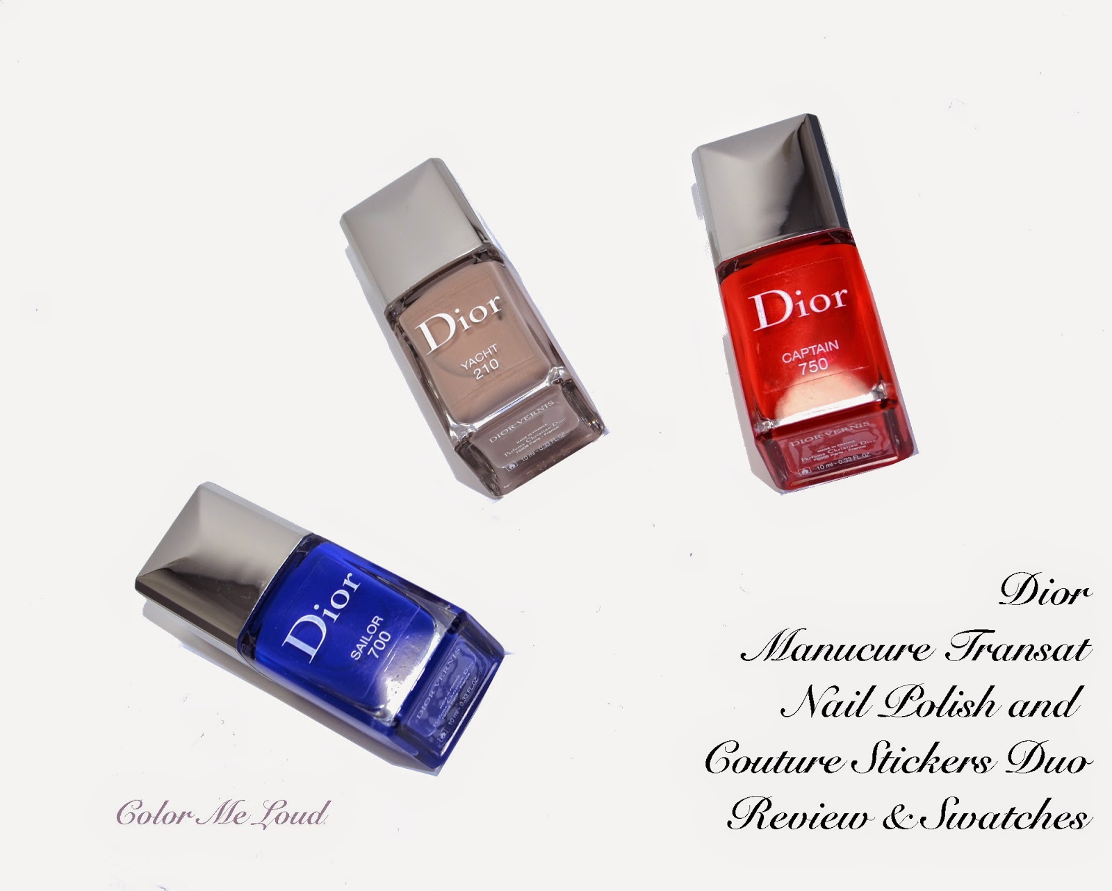
Dior Manucure Transat #210 Yacht, #700 Sailor, #750 Captain Nail Polish and Couture Stickers Duo for Summer 2014, Swatches & Comparison

I am being much behind the posts but it has been a busy week. The ones I promised about will be coming up very soon, as Easter Holidays are approaching and I will have a few days off. Today I have three gorgeous shades from Dior's Summer Collection. Don't you think these three look so pretty together?

Dior Manucure Transat #210 Yacht, #700 Sailor, #750 Captain

Thanks very much to a dear friend, I got these from the early release of Saks. All three polishes come in a bigger box, combined with a cute mini Dior file and nail stickers. These are called Manucure Transat, Nail Polish and Couture Stickers Duo. As the theme of the collection is sailing, they have fun names, Sailor, Yacht and Captain, which makes you say Ahoy! Here are the contents of the package.


Package Contents of Dior Manucure Transat Nail Polish and Couture Stickers Duo

I would like to start by #210 Yacht. This one is that kind of cool natural that I can't get enough of. I can only wear nudes when they are somehow cool or natural. Yacht has a great consistency and it is opaque in two coats. I find them much modern that way. Here is Yacht in shadow and under sun. Although the second picture shows something like a shimmer, this is just reflection of light. Yacht is a true creme.

Dior Manucure Transat #210 Yacht 
Dior Manucure Transat #210 Yacht

It is no surprise that Yacht is close to some other cool naturals I am loving at the moment, including Burberry #103 Ash Rose (reviewed here) which is cooler, Tom Ford Sugar Dune (reviewed here) which pulls more pink. Chanel Frenzy is cooler and Dior #257 Incognito is darker and pinker. I don't have any dupes to Yacht in my collection.

Comparisons for Dior Manucure Transat #210 Yacht 

#750 Captain on board! It is a orangey vivid red with a creme to jelly finish. With two coats Captain is not totally opaque and my nail line can still be seen. This one will make a great summer shade since it just glows under the sun. Below you can see the swatches in two coats and without top coat in shadow and under the sun.


Dior Manucure Transat #750 Captain 

Captain drove my camera crazy, so did the comparison shades all together. Dior's jelly red Calypso is lighter and pinker, Tom Ford #12 Coral Blame is very close and slightly darker. A recent Dior release, Trafalgar is cooler but also close. Chanel #677 Rouge Rubis is darker and cooler.


Comparisons for Dior Manucure Transat #750 Captain 

I saved the best for the last, Sailor... I was thinking I had vivid blue cremes in my collection but I didn't know that I had to yet have the best one coming to me. I love this one on my fingers, it glows, in a good way. It is not neon and this blue is so saturated and pretty, it takes my breath away. Sailor is a true creme and is perfectly opaque in two coats. 


Dior Manucure Transat #700 Sailor 

Dior Manucure Transat #700 Sailor 

I compared Sailor to some other blues, which I thought to be vivid. Look at Dior's Electric Blue or YSL's Bleu Majorelle, they are both lighter and more muted. Chanel Magic is much darker, Dior #607 Blue Denim is Darker and warmer. I have no dupes to Sailor in my stash, also this one makes it now to my favorite mid-blue category. Love at first sight!


Comparisons for Dior Manucure Transat #700 Sailor 

One more side note, these have the new brush of Dior but I don't think they have the gel effect quality of the new shades. It is hard to tell but new polishes do last a little longer. You can see my swatches of the new shades here and here. One more post is coming up with 5 more shades, so stay tuned.

Final thoughts: Three lovely shades from Dior for our summer tips and toes. I have to yet try out the stickers, which look like fun too. My picks would be Yacht and Sailor, which are unique to my stash.

Have you ever tried stickers on your nails? What is the best way to apply them? All tips and tricks are appreciated!
Share:
© Color Me Loud | All rights reserved.
Blogger Template Crafted by pipdig